Branding, logo, UI/UX + app design
Javlin
Overview
This is your handy pocket tool that will help you take your investments to the next level with a smarter approach to risk and return. You will now be able to make data driven investment decisions with confidence.
My role
My client came to me with a brilliant idea to change the perception of investment tools, often seen as daunting or not easy to use. I was very excited to work with them on their innovative product.
As the Art Director and UX/UI Designer for this client, I helped them to establish a color palette, design system, iconography, logo design and mobile app design. The mobile app design included thinking through micro interactions, transitions and animations to make the user experience friendly and engaging.
Exploring possibilities
The 3 W’s (Who, what + why)
Who is the target audience?
What message do you want your product to convey?
What do you want your audience to associate with your brand?
Who are the competitors?
Why would someone choose Javlin? What differentiates you from your competitors?

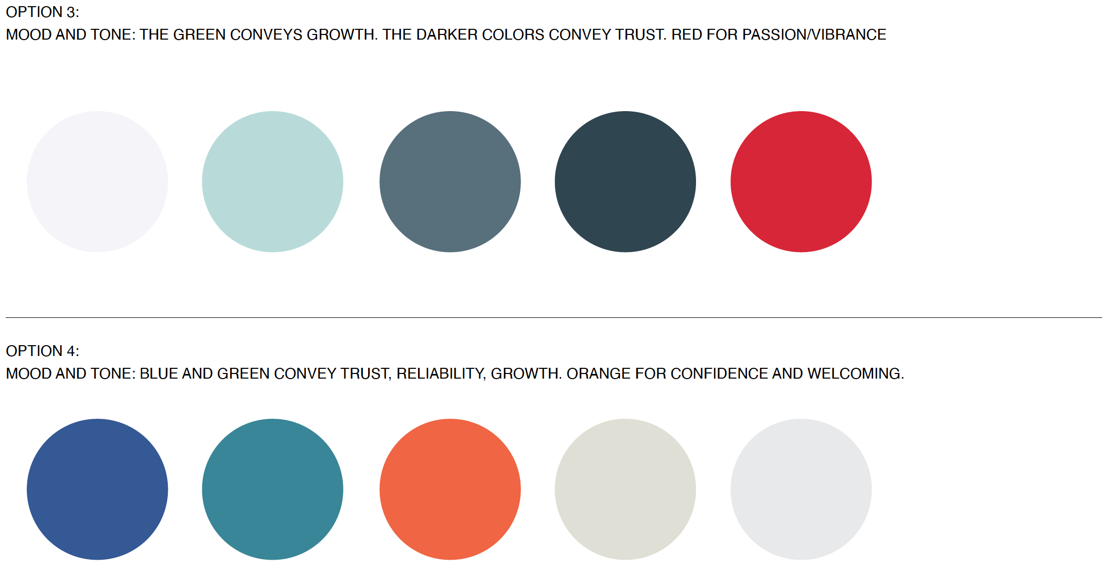
Defining the colors
We did an exploration on color families before we settled on the final color palette. Consideration was taken on the meanings behind the hues, the type of energy it conveyed and how all the colors in the design system would work together.
There needed to be colors that were similar in tonal value as well as 1-2 brighter, more contrasting colors. The brighter colors were efficiently used for items we needed to stand out in data visualizations and certain error message or notification use cases.

Logo brainstorming
I provided my client with logo options exploring typography, illustration and iconography.

Wordmark logo concepts


Illustration with wordmark

“How do we make our product look sophisticated and upscale, while also communicating that it is a powerful financial management tool? ”
Designing the app
Before diving into the visual design of the app, I met with my client to discuss competitor analysis, goals, and KPIs. They had created an initial prototype which I did a UX audit on, to reevaluate the user flow and experience. We discussed my feedback on the overall app, the flow and actions for each screen as well as how to bring branding into the design of the app.
Defined a user flow

Explored options by wireframing

UX audit on their initial prototype


Created a custom system of icons
Login and authentication
To make the login process easier, we utilized face recognition while also allowing password submission for users to log in.
UI design
I explored different styles of illustration, iconography, colors and fonts, to create a brand communicating “sophisticated and upscale” and the concept of a luxury, sought-after investment power tool.
Micro-interactions
I looked for ways to bring delight to the user through triggered transitions and animations. The goal was to engage users but not to distract or confuse them from completing tasks. All assets, interactions and notifications were discussed and annotated before handoff to development to ensure a consistency of experience and feedback for users.
Profile creation and onboarding
Profile creation and form completion through a more engaging and fun experience to minimize the feeling of tediousness.


