Product design, UX optimization + Strategy
CVS Health
Overview
CVS Health is committed to providing communities with access to affordable, quality health care and wellbeing services they need. Access to team-based care services are available in local communities, at home and virtually.
These services include primary care, condition management, mental health support, prescription refills, and long term care.
My role
As the UX Lead, I led a team of designers in driving enhancements informed by UX research, testing, and our users’ needs based on a JTBD framework.
Within an enterprise agile environment, I work closely with product, clinical, research, and engineering partners to deliver solutions through agile delivery, making adaptations based on our users’ feedback. The goal is to continuously improve and make the experiences better. Long-term vision work is shared with product partners early, to collaboratively prioritize and plan a roadmap and backlog.
Covid & Flu Test and Treatment
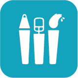
The problem to solve was that the existing landing page represented a legacy experience. By updating the COVID landing page, it would help users understand the various options available for testing and treatment, enabling them to choose the best option for their needs.
The challenge was how to clearly communicate the multiple options available. Patients could get tested by scheduling a drive-thru visit through the Pharmacy, schedule an in-person evaluation at MinuteClinic, purchase an at-home test, receive in-person testing and treatment, or get treatment only if they had already tested positive. The amount of options available as well as the multiple lines of business that offered these services, held a risk of putting too much cognitive load on patients to choose correctly.


Legacy page
The previous design presented some challenges where there was a lot of information on the page, but not organized in a way that made it easy to skim or understand. It was unclear what options were available to patients. It required more work and hunting for information.
Data showed that the highest level of engagement occurred in the FAQs, while the lowest engagement was in the link to sign in to view the health dashboard.
Users were also unclear about where the CTA at the top of the page would direct to. It did not specify which type of test or treatment was in that flow.
Brainstorming and wireframing
To make this page easier to understand and more efficiently get users into the scheduling flow, I provided solutions to reorder the content, redesign the structure of the page, and clearly define priority and secondary actions.
Solution
By creating a clear primary action to Get Started, distinct from the secondary flow where an individual has already tested positive, it resulted in patients being more confident to click through. The two pathways also helped direct patients to the services they were looking for.
Design strategy
Rather than a long list of states to sift through, a more concise solution was to call out specific ones
Including a How it Works as a simple 1-2-3 makes it feel friendly and more digestible
Providing dedicated spaces for different groups of information makes it more organized and readable
Additional resources and FAQs as helpful tools as the final, positive impression at the bottom of the page, helps build trust with users
Renamed the link that had yielded low to zero engagement to an action that connects patients with the value. Instead of “Sign in to health dashboard” the renamed link is, “Sign in to view test results”
Relevant actions in each section directs users to the right flows, improving engagement and CTRs

Kiosk Redesign
The in-person checkin process has been reimagined with a new kiosk system, delivering a faster, more intuitive, and accessible experience. Over 81,000 additional patients received care who otherwise would have been turned away. Wait times dropped by 20 minutes, boosting clinic efficiency and enabling more patients to receive care. Providers also benefited from clearer waitlists and better visibility into the patient flow, making time management easier.
My role
I provided UX strategy and design support, partnering with one other UX designer, in collaboration with retail, clinical, engineering, pharmacy, and accessibility teams.
Problems to solve
Dated kiosk system and user interface that was not accessible
Patients had difficulty with the forms and finding their information to check in
Lack of logical grouping of content, making it challenging to progress through the steps
Unclear system status to patients for wait time or position in line
Disconnect and lack of communication between the digital and kiosk check-in flows
Previous kiosk system
Patient journey
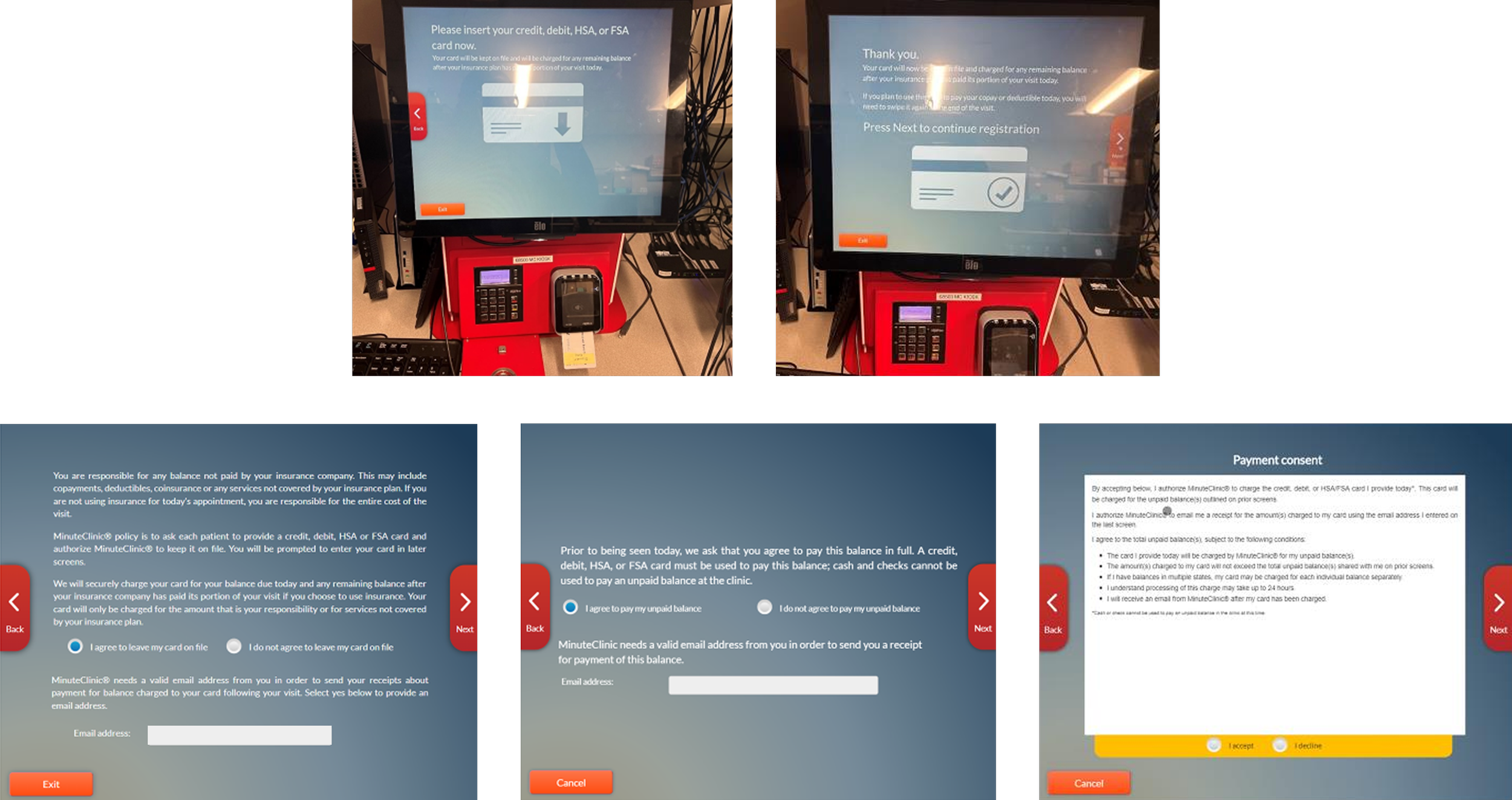
UX and Accessibility Considerations
Touch target size for kiosk screen for a 15.6-inch HD display at 220.3 PPI
Minimum font size and distance between touch targets or buttons
Physical keyboard or a keyboard that slides up on screen
Amount of vertical space on screen needed to account for digital keyboard
Consideration for a “clear text” button within each field instead of “clear all” functionality
Error states for required fields and consents
Modal dialog and proper implementation when using for alert type messaging
Kiosk will prompt user to scan QR code to complete consents and other pre-checkin tasks on phone, but how do we include those who do not have a phone or service within the clinic?
What is the impact on a patient’s visit time if they did not have enough time to complete their consents while they were waiting?